One of my most popular blog posts to date is my How to Find Your Instagram Aesthetic entry. I wrote it early last year when I first got the hang of editing with presets and finding my own personal aesthetic. At the time I was using Tezza’s presets and later went on to create and release some of my own which you can buy here.
I’ve learned a TON about editing since then and the one thing I have found that keeps my photos cohesive is having a consistent skin tone throughout my feed. I know, you’re probably thinking how random. But I’ve honestly found that if my skin matches from one photo to the next then my edits and overall filter/preset can vary!
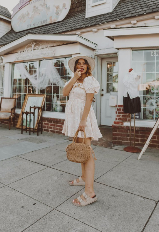
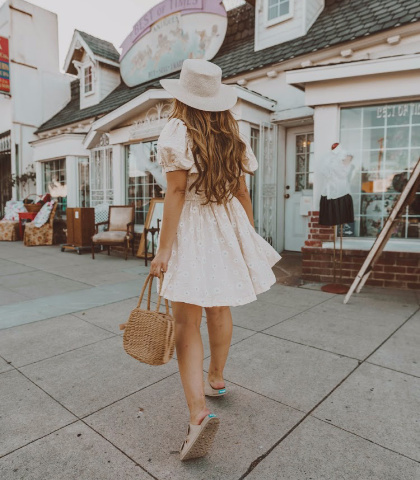
OFF SKIN TONES
I wanted to start off with an example photo from my feed of photos that don’t match in skin tone. Just analyzing my skin, the photo on the left has a pink hue and is rather tan while my skin in the right is brighter with a yellow/green hue. I used different presets for these photos but had I upped the hue to more pink on the right photo and brought down the orange luminance it would have matched better.
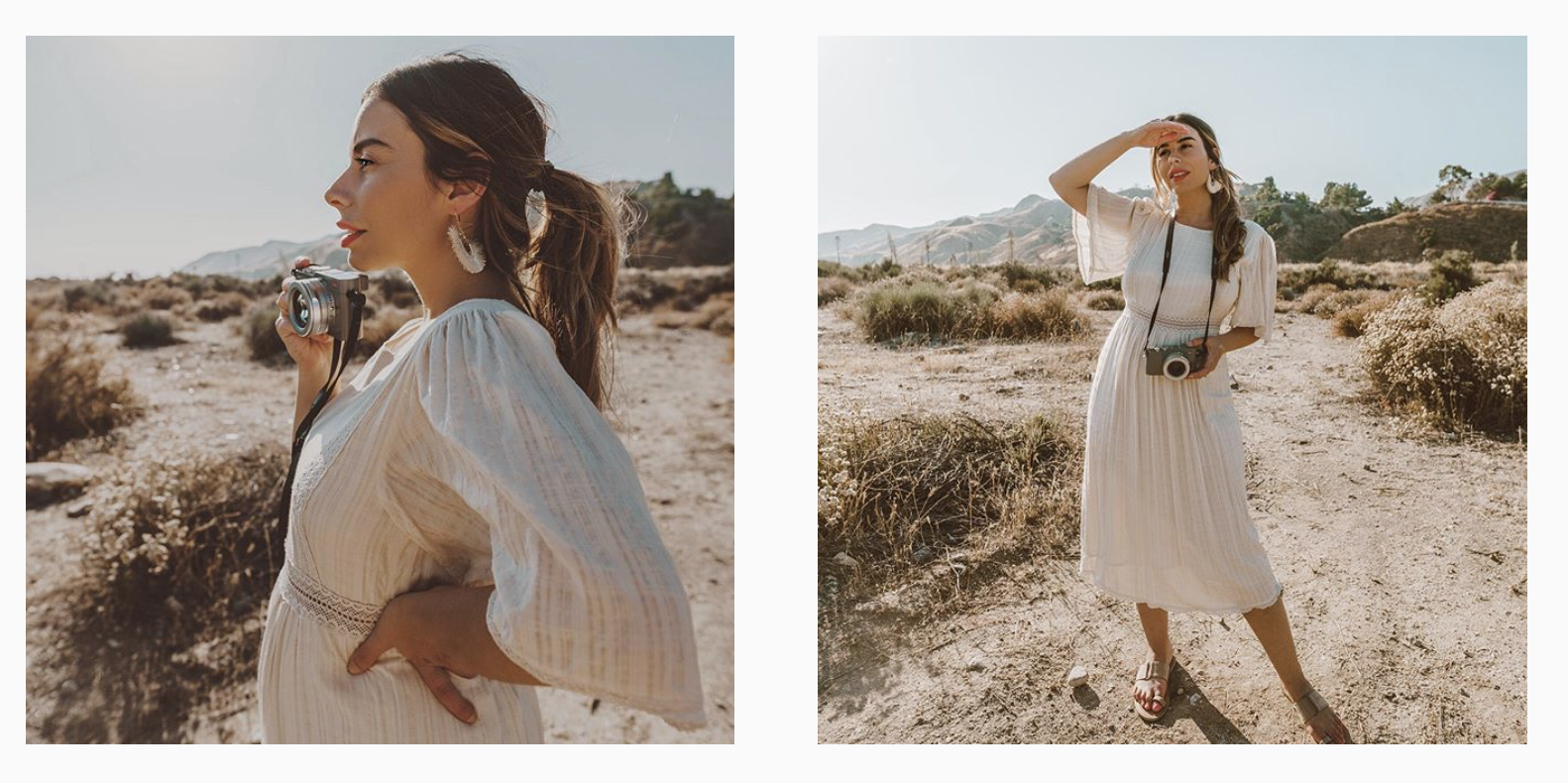
SKIN TONES THAT MATCH
The photos below show a better example of matching skin from photo to photo. They both have a pink hue and a tan, flat complexion.
So how do you achieve similar skin tones with such a wide range of photos? Hue, Luminance, Saturation and Spot Editing!
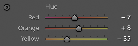
HUE – The first thing you have to decide is what hue you want on your skin. And yes you can change it dramatically although I highly encourage you not to, stay as true to your skin tone as possible! The key colors in your skin are Red, Orange and Yellow. Playing with the HUE on each of these colors in Lightroom will change the color of your skin. By dragging the hue to the right you will get a more yellow/green skin tone. Dragging the hue to your left will produce a lot more pink! I personally like keeping my reds and oranges within the +-10 range but my yellows are always more pink because I like the look it creates.
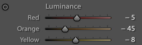
LUMINANCE – The luminance controls how light and dark a color is. For luminance I mostly focus on the Orange. The darker you make the orange the darker and flatter your skin will be. The brighter you make the orange the lighter your skin will be. The luminance is super subjective to the lighting conditions of your photo so you will 100% have to play with this photo to photo to achieve your desired look.
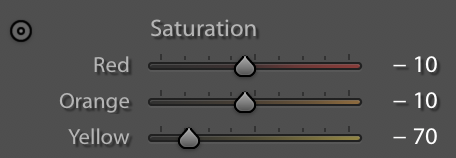
SATURATION – I used to love a super saturated look in my photos. Not anymore! I try my best to avoid looking SO orange in photos. That’s where saturation comes to play. I edit the Red, Orange and Yellow on this field. My yellows are always -50 to -80 because I don’t like yellow in my photos. My orange and red is usually around -10 to -20 depending on the photo.
Spot Editing – I use Snapseed to spot edit if I need to. Spot editing allows you to pin point a certain area of the photo and edit only that highlighted area. I used the SELECTIVE tool, pin point exactly the area I want to edit, make the red circle (you will see this once you try for yourself) larger or smaller to cover my skin area and then play with the Brightness and Saturation.
As always editing is all about practice! Take your time and play with these tools to create a uniform skin tone in your feed.


Thank you so much for making this post, Emily. I am just learning to edit and I get so frustrated with lightroom sometimes!
Jill
https://jilliancecilia.com/
Hey Emily ♥
With what preset did you edit the photo on the top?
Would love to know xxx